Improving Largest Contentful Paint on slower devices
Published: Sat Mar 09 2024Looking at our real user metrics, we noticed that our histogram followed a bimodal distribution. A multimodal distribution has more than one mode (a.k.a. peak) and a bimodal distribution has two. Segmenting the data into two groups and optimizing each one separately allowed us to improve our website’s Largest Contentful Paint for most of our users.
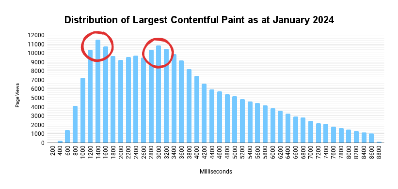
The histogram above is taken from January and the two modes are highlighted in red. After careful examination of the data available, we used SpeedCurve to segment our data by device memory. The API has some minor limitations due to privacy, but it allowed us to correlate performance with the user’s device. We could also see that almost all of our users are evenly split between 8 GB and 4 GB devices, with very small numbers for 2 GB and 1 GB devices.
Unsurprisingly, devices with more RAM—and most likely better CPUs—perform better. What was more surprising was the huge difference in loading performance between these user segments.
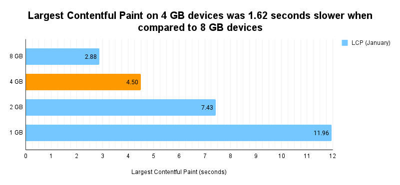
As illustrated in the preceding chart, in January, users with 4 GB devices had a loading experience that was almost 2 seconds slower when compared to 8 GB devices. The performance continued to degrade even further on 2 GB and 1 GB devices.
We identified several issues that were contributing to the slow loading performance users were experiencing on low-end devices. I will be writing about these in more detail in a future blog post, but in a nutshell, the majority of issues were CSS-related.
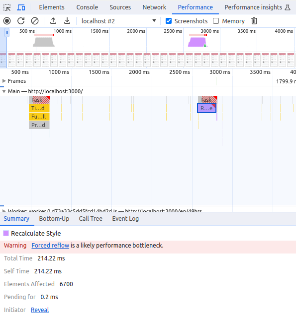
For example, on interaction with one button, we would add touch-action: none to the <body> tag. Surprisingly, this affected all DOM elements (6,700 elements in the screenshot above), causing style recalculations—that while negligible on a high-end device—were blocking the main thread for more than 200 milliseconds on low-end phones.
Over two months, we improved LCP on 4 GB devices to 3.4 seconds, reducing the gap with 8 GB devices.
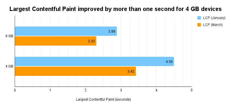
The preceding chart shows that LCP on 8 GB devices improved from 2.88 seconds to 2.30 seconds (a 580-millisecond improvement), while performance on 4 GB devices improved from 4.50 seconds to 3.42 seconds (a 1,080-millisecond improvement).
Conclusion
It is useful to recognize if your data consists of two or more distinct groups of users. If your histogram has two modes, understanding and recognizing why you have two groups can be a powerful tool for improving your website’s performance.
In this example, the two groups contained users with different hardware specifications. In other examples, groups may arise from different geographical locations, user behavior, or maybe one group is irrelevant to you. In any case, understanding the differences between these groups of users helps you improve the user experience for all of them.
Thank you for reading. Feedback is always welcome.
Notes
- The website is a single-page app built in React. It is dependent on JavaScript for almost anything, including rendering critical content and—in most cases—the LCP element. Fixing that is a story for another day.
- All charts included in this post show data from the home page on mobile devices.
- The data is sampled and was collected using SpeedCurve. Visualizations are my own.
- An export of the data is available on Google Sheets.
Latest Updates
- I got phished!Tue Jun 16 2026
- On writingThu Jun 26 2025
- Adding a CrUX Vis shortcut to Chrome's address barTue Apr 15 2025
- Contributing to the Web Almanac 2024 Performance chapterMon Nov 25 2024
- Improving Largest Contentful Paint on slower devicesSat Mar 09 2024